Graphics and 2D Artwork
|
|
Freelance GraphicsThese graphics were created for Speck's Pet Supplies employee training seminar for the summer of 2022. The theme of the seminar revolved around the mystery genre, and as such, I took the company's mascots and dressed them in stereotypical detective attire.
The two mascots were also featured on the employee's name badges. Participants could choose which character they wanted. The dog was presented as a grizzled hard-boiled PI, whereas the cat was dressed as a secret agent in order to keep with the mystery theme. |
|
|
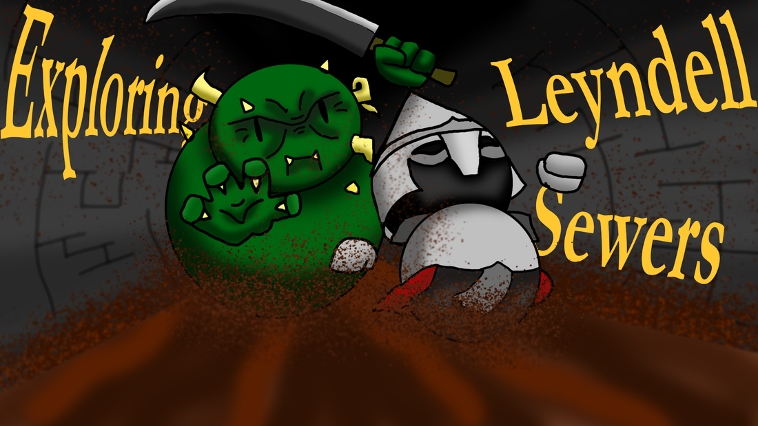
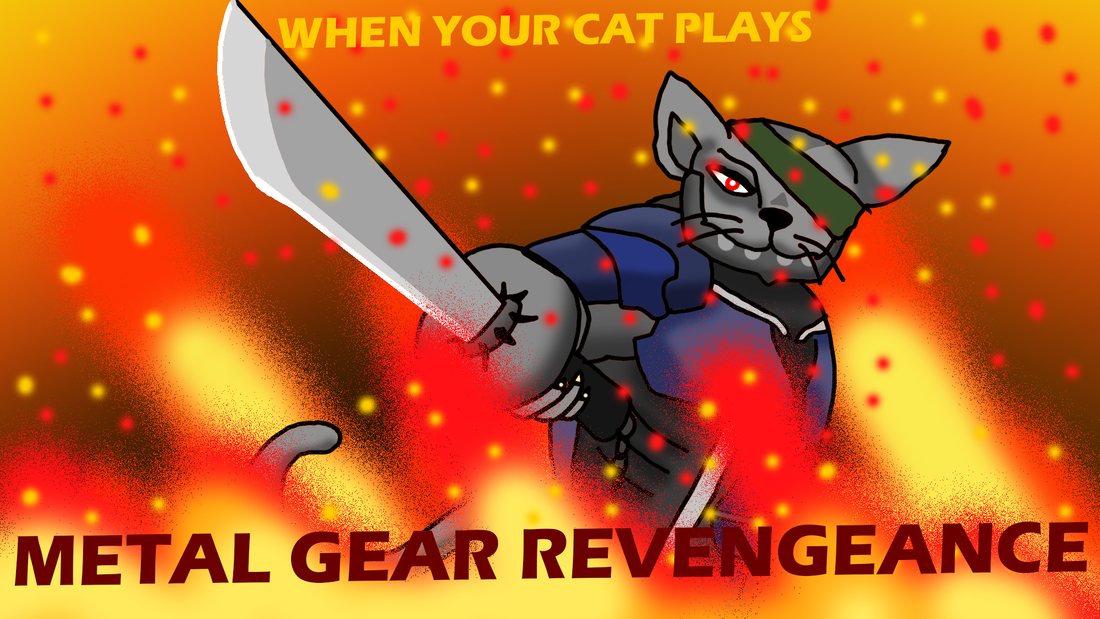
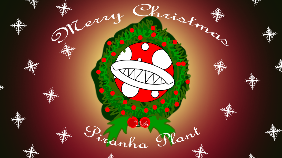
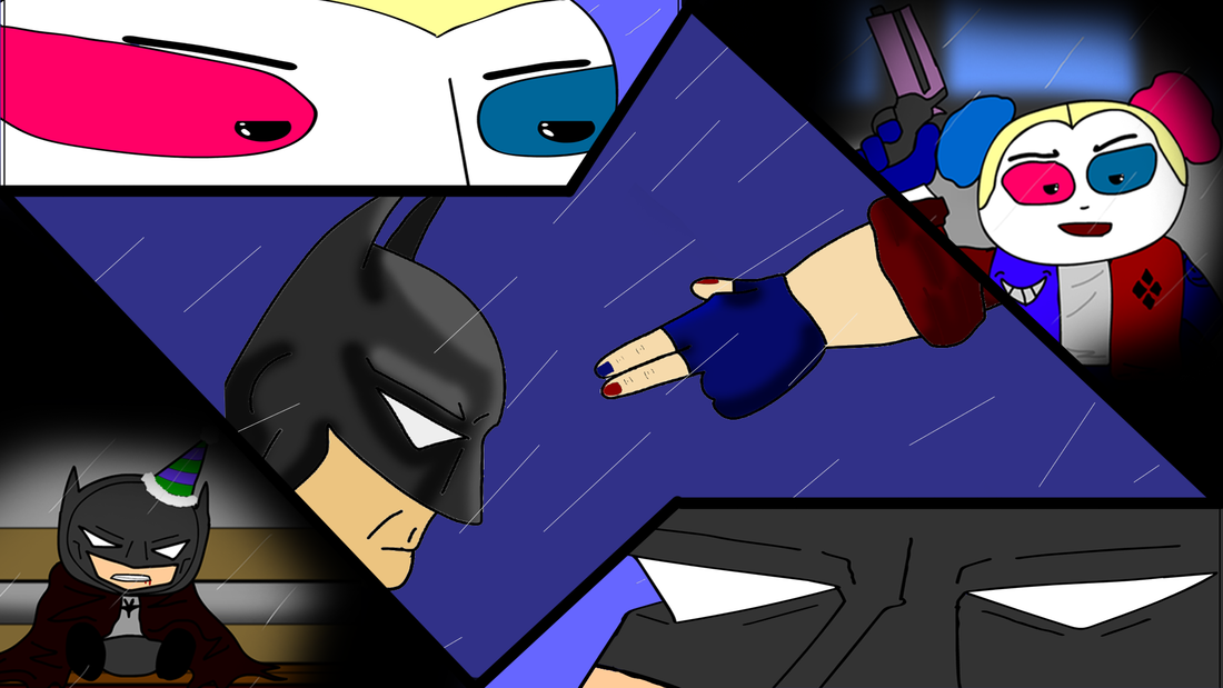
YouTube ThumbnailsHere is a selection of video thumbnails from my YouTube animation channel, SmithyToons.
Much of the content is short comedic animations that parody popular video game franchises, books, and movies. My goal with each thumbnail is to create something that is visually appealing, yet also accurately gives a preview to the viewer for what they can expect from the video. |

|
|
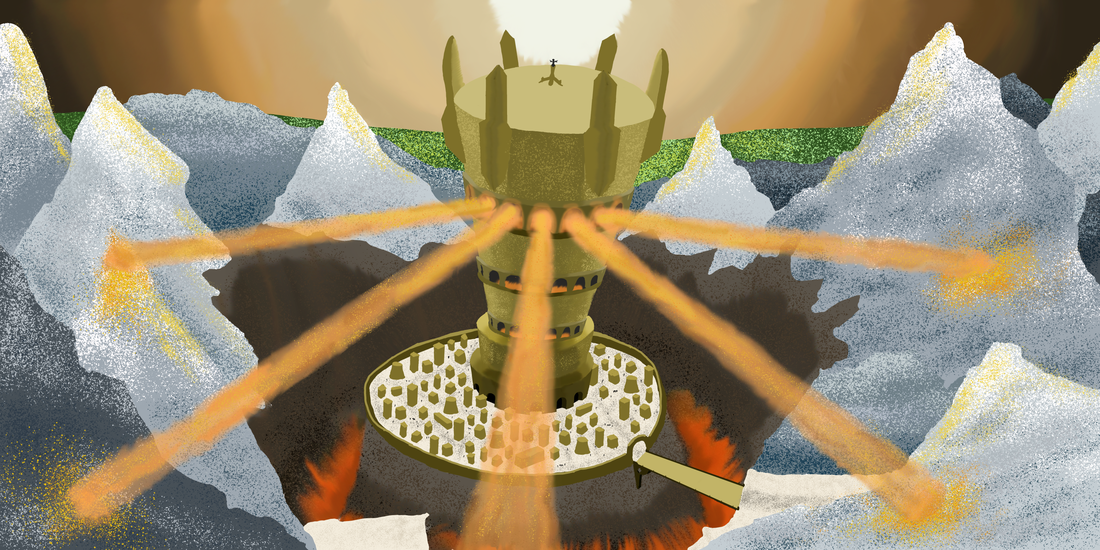
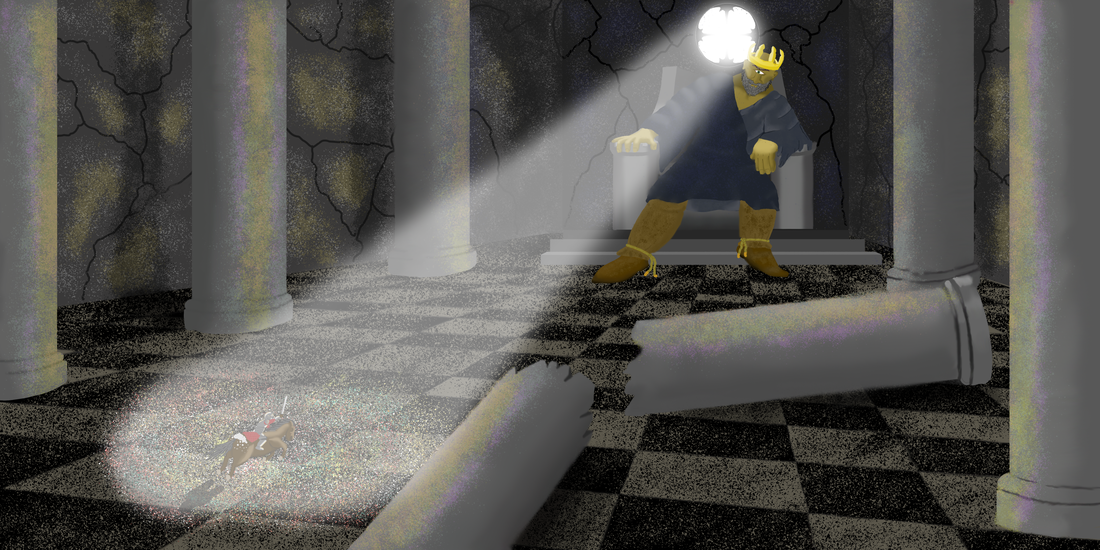
IllustrationsThe following illustrations are the art for a fantasy story that I've been conceptualizing.
The first depicts a gnome in his natural habitat, a quaint shack with a garden. I was very much inspired by depictions of Tolkien's Shire as seen in The Lord of the Rings. As such, much of the same vibrant colors, and rural setting have appeared here. The next illustration depicts a bronze castle, shining in the mountains. For this piece, I wanted to evoke a sense of primeval might that is associated with Bronze Age empires. As such, I used a lot of dull brown tones, and based the structure of the castle as a mix between the Tower of Sauron, and Babel. Then at last is the throne room of the Giant King, where our heroic knight makes his final charge. Here I played a lot with the themes of duality, light versus darkness, good and evil. |

|
|
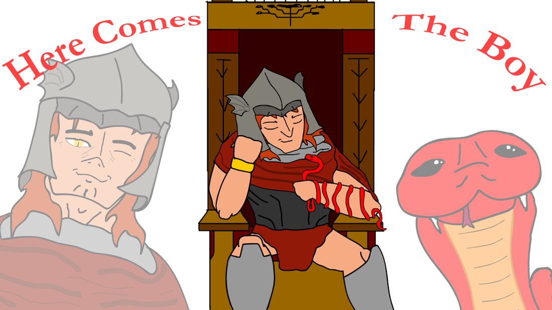
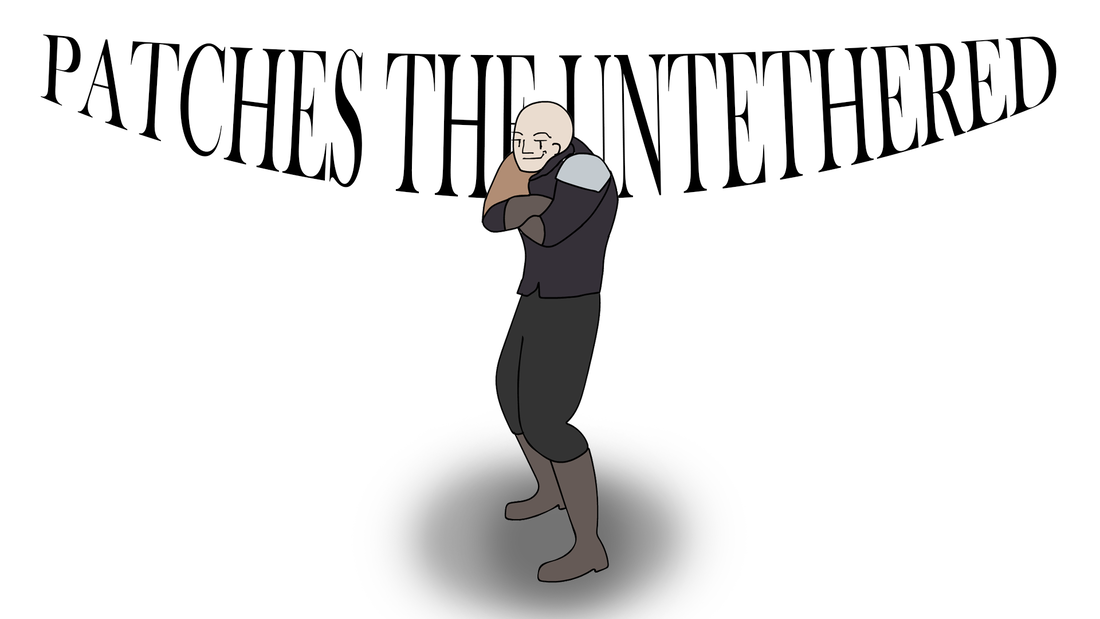
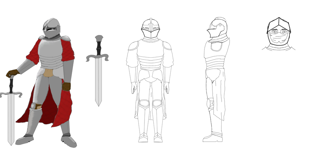
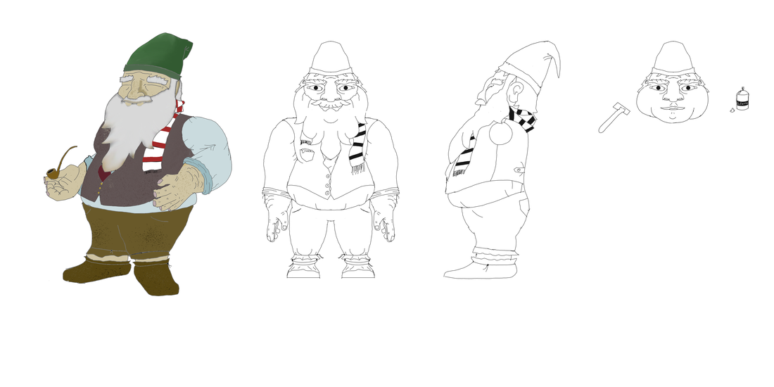
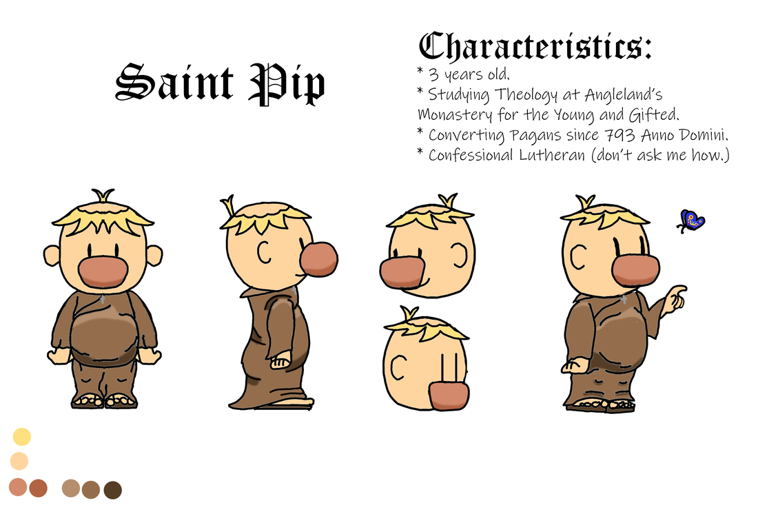
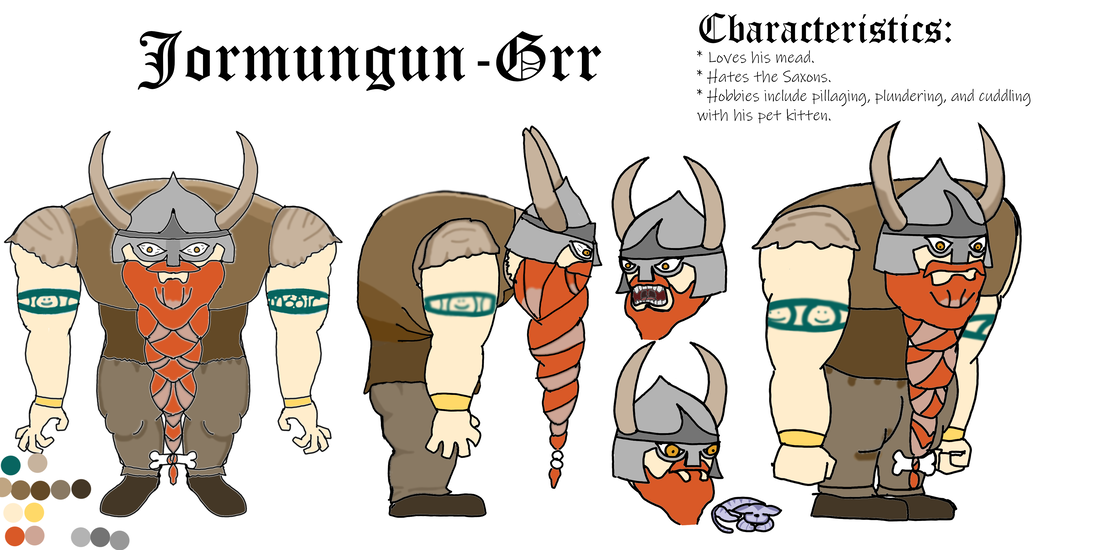
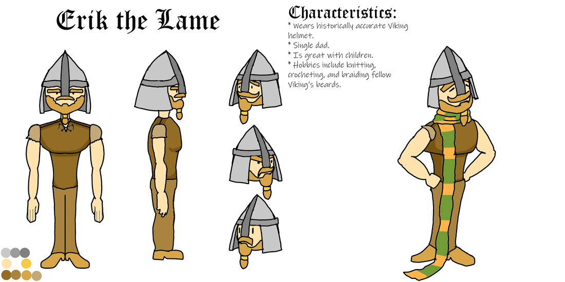
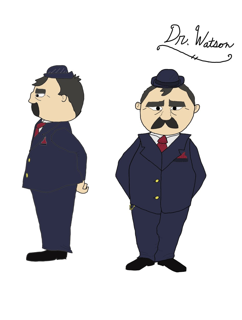
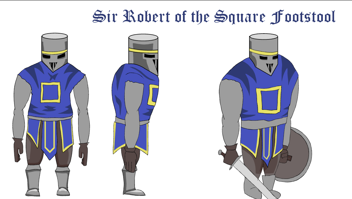
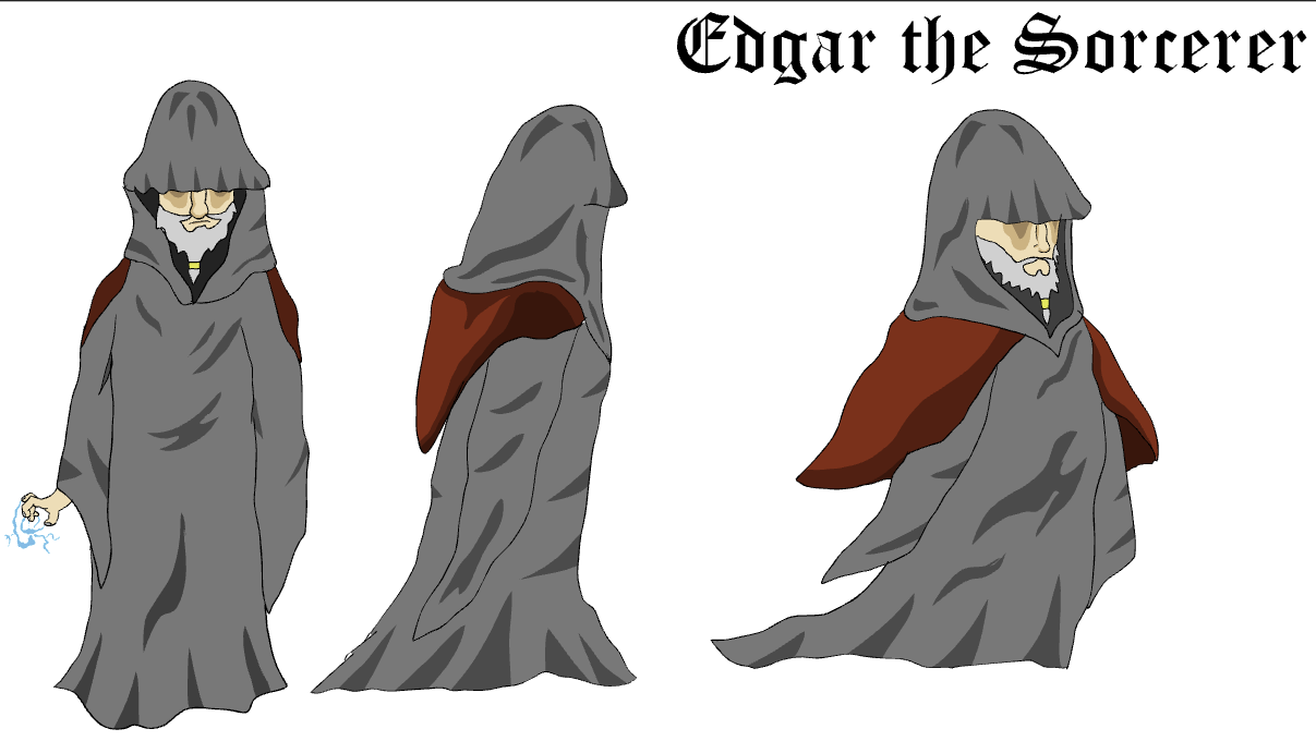
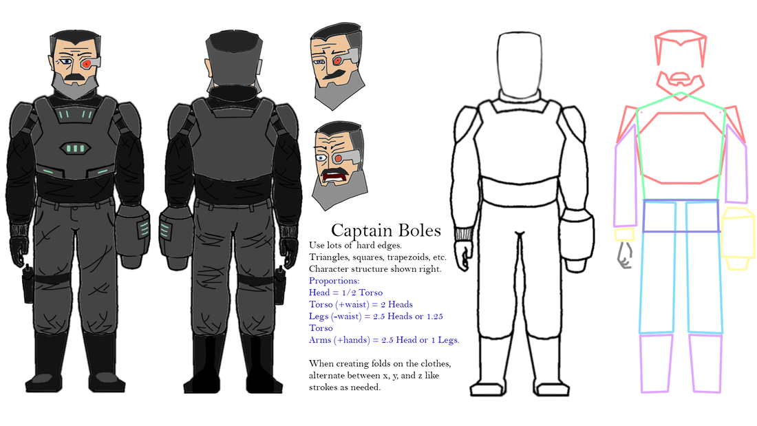
Character SheetsIn this list are various character concepts that I have used for my other projects. Many of them appear elsewhere in my works, be it animations, illustrations, or writings.
Many of my characters are drawn in a playful style, reminiscent of classic Sunday Morning comic strips. |
|
|
Book CoversThese two designs are the front covers of my two published novels. I designed and created them myself using Photoshop and Illustrator.
The cover for Mr. Kingsley's Library has a simplistic style meant to evoke a sense of wonder and whimsy, going along with the tone of the story. The cover for Jakob and the Knights of Nohra is much darker, however. My intention with it was to establish a foreboding atmosphere along with a sense of epic scale. My goal with both of these designs was to visually inform the reader about the tone of each of these titles, and what they could expect from each of them. |
